

Behind the scenes of Mindiply Timeline Episode 1: Of Dependencies and Old-School Gestalt Psychology
Francesco Marcatto22 Mar 21
Mindiply Timeline will be finally available soon (please read this “soon” as: soon, but not ask us the exact date!), in the meantime we’ve decided to start a new series of articles in which we describe the making of our new online tool for Project Management. Indeed, when you design a new software, you have to make a huge number of choices. Some are merely aesthetic and will have a small impact on the user experience, others are more radical and will have a stronger effect, and lastly, some other choices are less obvious, but could definitely change the way the tool is used and perceived. In these new articles, we want to share with you some of the challenges we’ve faced during the design of Mindiply and how we came to the decisions which are reflected in the final design.
The framework
Before talking about the first “behind the scenes”, here are just a couple of words about the very basic stuff, aka our framework. We’ve followed an approach that combines the user-centred design and the nudge framework. In other words, most of our ideas came from a vast amount of knowledge which includes best practices in project management, management science, and cognitive psychology. And, at the same time, we’ve interviewed many, many project managers, from newbies to very experienced ones, both to understand the problems they face in their day-to-day work and what they expect from a PM tool, and to test with them our solutions and design ideas. The basic idea is to give people what they need to work better and smoothly, in a friendly environment which will make it natural to follow PM best practices, even for people who don’t know them.
Unusual Dependencies!
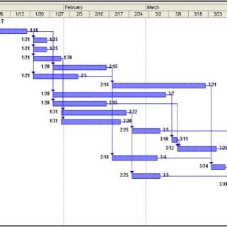
One of the most basic features of any serious PM toll is the ability to track and display dependencies. That is, to show that activity B can start only after activity A has been completed. This is especially relevant because you know that a delay in activity A will make all dependent activities wait until activity A is over. Otherwise, if activities are not dependent, delays in A won’t affect B. That said, in Gantt charts, timelines and other PM stuff, activities and tasks are pretty much always displayed as rectangular boxes and dependencies as straight lines with 90 degrees angles that connect these boxes. The picture below is an example.
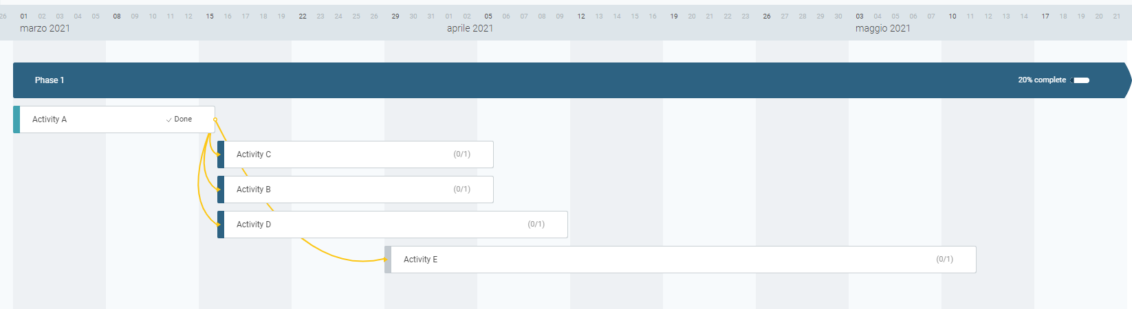
There’s nothing wrong with this approach. However, in Mindiply Timelines we’ve decided to display dependencies as curves, as you can see in the next picture.
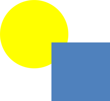
Yes, we know it’s quite unconventional, but it’s not a casual choice and here’s why. Gestalt psychology is a very influential movement that was developed about one hundred years ago in central Europe (mostly Germany, Austria and Italy). One of the biggest contributions of the Gestalt psychology, was to identify the principles of visual perception, which are seven “laws” that explain how we perceive objects. In our case, it’s relevant the Law of Good Continuation (also known as the Law of Continuity), which states that we tend to perceive complete objects even when they overlap. Take for example the next picture: we see a yellow circle behind a blue square, not a yellow “something that resembles a circle but without a section” next to a blue square.
Ok, but what about our dependencies? The Law of Good Continuation also says that we are more likely to perceive the “good continuation” with curved elements than whit elements with sharp abrupt directional changes. Take, for example, the top panel of the next picture. Is activity C dependent on activity A (with the line passing behind activity B) or from activity B, which in turn is dependent on Activity A? The T-shaped intersections between the dependency line and the box of activity B make things a bit ambiguous for our cognitive system. Understanding what’s happening in the bottom panel, on the contrary, is much more easy and natural: B depends on A, and the dependency line passes behind activity C. Other interpretations are very very unlikely. This is the perceptive benefit of using curves instead of straight lines with right angles: a small design change, but a big step forward in making the tool more cognitive-friendly.

Sure, there are other alternatives, such as displaying the dependency line above the activity boxes (it works, but it is not pleasant to see and potentially problematic when there is text inside the activity box) or using lines with different colours (this could lead to other issues due to too many different colours on the same chart), but we really love the elegant simplicity of the curves-based solution. And what about when you are dealing with a very complex project, with many activities and dependencies, and seeing all those boxes and lines causes you a headache? Don’t worry, we’ve included the option to filter out the dependency lines. We all need some peace of mind (and eyes!) sometimes! That’s all for this first article about the making of Mindiply Timeline, stay tuned for the next ones!
Cover picture by Freepik
Related articles


Want to see Mindiply timeline in action? Start a 30-day free trial today